
The newest shades of color for the upcoming year have been chosen. Vibrant and fresh, the top 10 does not disappoint. Chosen by the Pantone Color Institute and showcased in this year’s London Fashion Week, we are guiding you through how homeowners and designers alike are using a mix of hues to create colorful interiors in their homes…
Meet the Palette
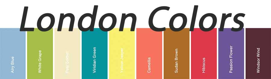
This upcoming year’s colors are striking and full of life. There’s truly something for everyone. We can’t wait to see the way these colors influence design in the coming seasons!
Say Hello to Timeless Neutrals
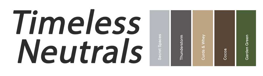
Simple and soothing, this year’s neutral palette warms up foundational colors with the natural hues of green and browns, while cooling things off with the grays. So many possibilities to use these–even on their own, let alone pairing them with the London colors above.
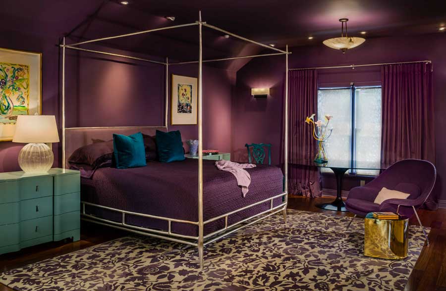
Moody Shades
Color drenching is the act of painting all walls–and the ceiling–with color. And, wow. The results are stunning. This exquisite shade of Windsor Wind makes a dramatic statement in this bedroom, a beautiful backdrop for the gold accents. The blue accents in the chair, side tables and throw pillows are an amazing pairing with this color.
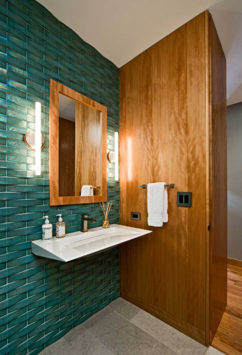
Dynamic Duo
Two colors from the upcoming year’s palette, Viridian Green and Sudan Brown, offer a beautiful combination for colorful interiors. The tile wall meets the wood paneling, both adding dimension to the space. The luxury feel of the tile contrasts with the earthy vibe of the paneling. It works so well.
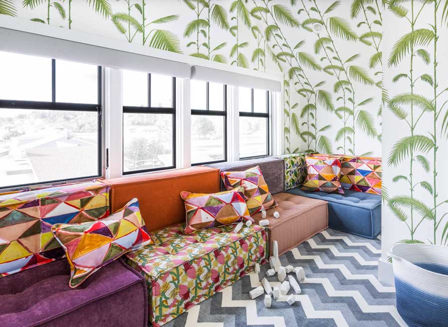
The Palette on Display
Who knew you could bring together so many colours in one space? This playroom is a custom creation, pairing handmade seating and coordinating cushions. The entire space is enveloped in wallpaper that makes it feel like it’s a tucked away tropical paradise.
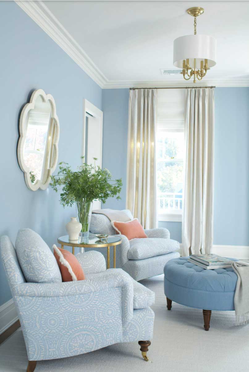
Soft Hues
This living room pulls together three of the softer tones from the palette: Airy Blue, Camellia and Pear Sorbet. These soothing colours create a sanctuary that’s made for relaxing, with an air of sophisticated elegance. The accents of gold create a coordinated statement with the candelabra lighting.
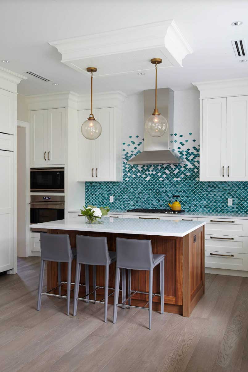
Unexpected Colour
Kitchens are quite often done in white. It’s timeless, but for some, that just isn’t exciting enough. It doesn’t end up feeling personal. The backsplash is a great way to bring a custom look into your home, and this one does not disappoint. Between the intentional design surprise of the tile, to the grounding energy of the wood grain island and softness of the gray seating, this kitchen is a style winner!
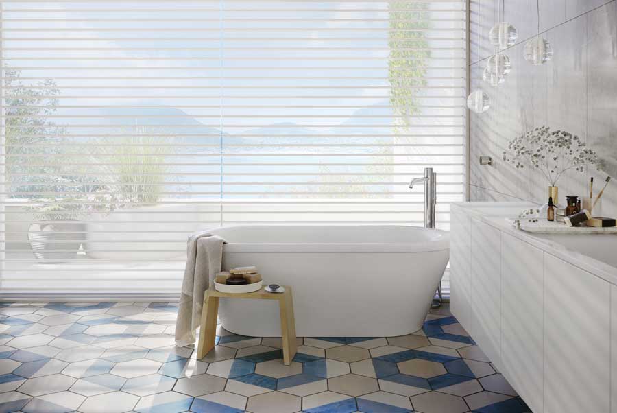
Which Window Coverings Go Well with Colorful Interiors?
The good thing about window treatments is that they can feature neutrals to blend, showcase exciting colours and patterns, or they can be sheer–showing off the outdoor landscape for a dose of the natural world’s seasonal colour scheme. It comes down to personal choice–and what window challenges you have in your home.
Our window covering specialists at Custom Shades of London will be happy to help guide you to the window treatments that bring out your personality while creating amazing solutions for your home. Get in touch for your free consultation today.